Case

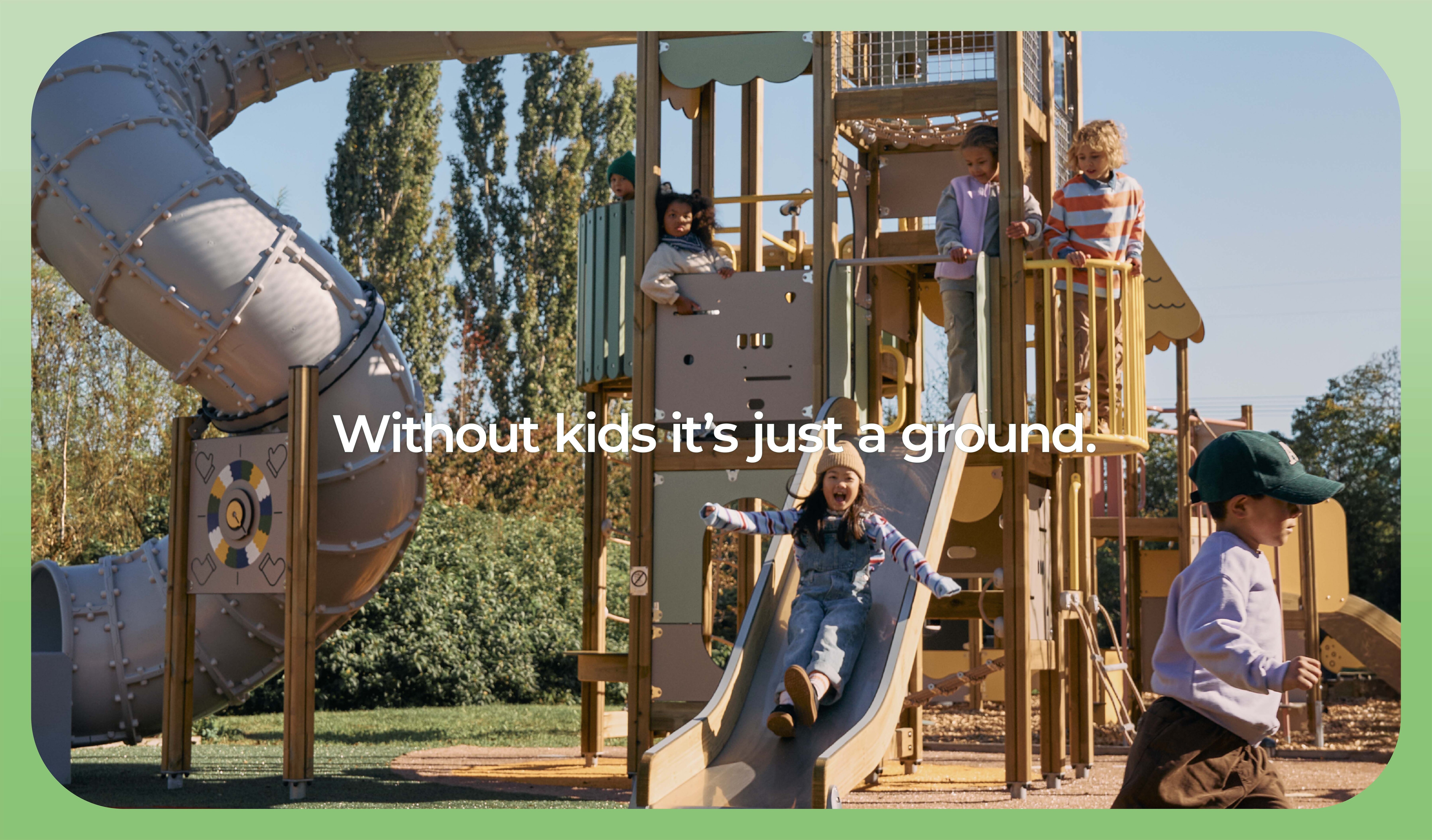
Without kids it's just a ground

How do you build a launch identity for a brand that has spent over 50 years mastering the serious business of play? You start with its roots.

Founded in Rovaniemi, Finland in 1970, Lappset Group Oy began with a simple, enduring belief from founder Antero Ikäheimo: outdoor play is essential. Decades later, that foundational philosophy remains untouched—even as the company scales globally.

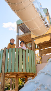
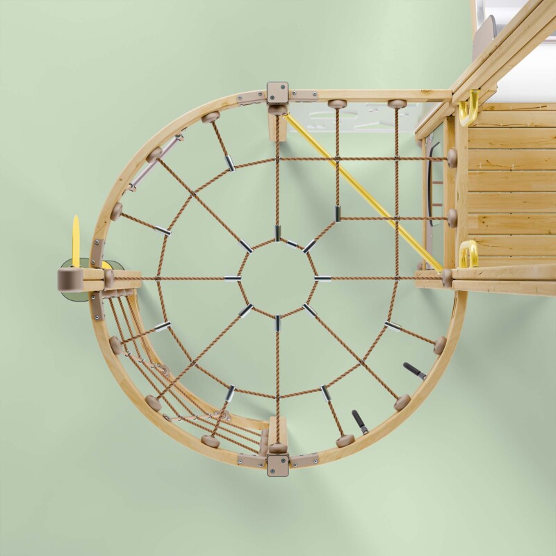
When Lappset developed Prime, its flagship collection of premium playground equipment, our role as their creative partner was to translate decades of behind-the-scenes engineering and developmental research into a distinct visual and narrative language. The challenge lay in striking a careful balance: the collection needed to feel seamlessly connected to the core Lappset heritage, while projecting a bold, authoritative presence in a highly competitive international market.

We designed the sub-brand identity, messaging framework, and global launch assets to bridge that exact gap. Because at the end of the day, design creates the stage, but it’s a child’s imagination that brings the playground to life.
Case Information

Client

Lappset

Scope

  1. Concept design
  2. Identity design
  3. Graphic design
  4. 3D visualisation
  5. Art direction
  6. Illustration
  7. Photography & Film
  8. Copywriting
  9. Content creation
  10. Brand & design guidelines

Awards & Recognitions

  1. Red Dot Winner

Photography Helsinki

Photographer: Vuokko Salo
Production: Nelli Lieto
Stylist: Mirkka Siusluoto
Video: Tuomas Klemola

A play manifesto

At the heart of a playground is a promise: The freedom to play without limits. We believe that this freedom actually begins long before the first swing, slide, or adventure. It begins with design. Our modular system gives landscape architects and designers the freedom to shape spaces that are as unique as the children who will explore them. Spaces that adapt, invite, and include. Spaces that turn imagination into reality. When design is free, play becomes limitless. And every child, of every ability and every background, finds a place where they too, can let loose.

The freedom 
to play without limits

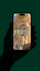
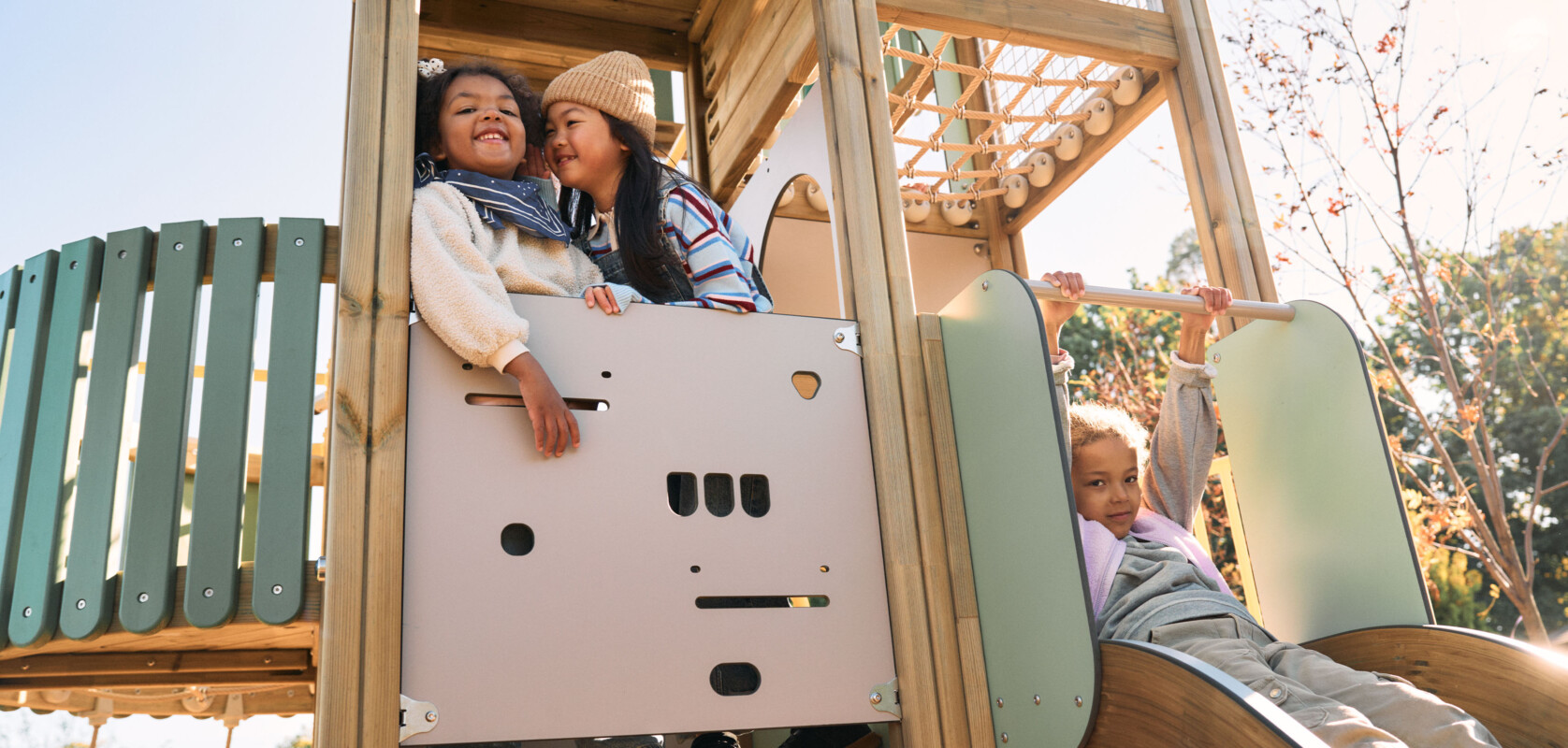
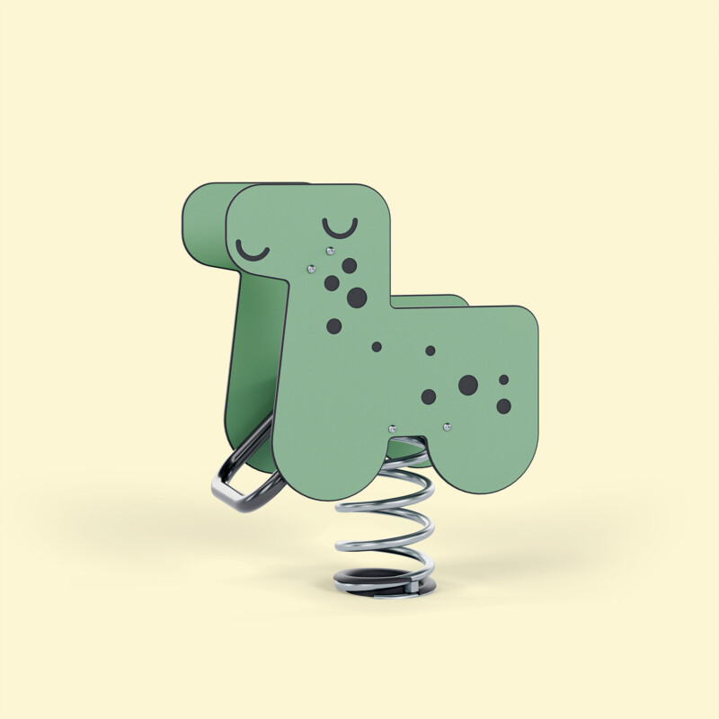
The core of the creative solution was found in the design language of the products themselves. Prime’s rounded shapes and modular structure inspired the logo, with a rhythm that reflects the playful nature of the equipment. Our execution placed the child’s imagination at the centre, introducing hand-drawn illustrations alongside video and photography. We used animation to reveal the secret world of a child’s play, contrasted against the physical reality seen by adults.

Play is a right, not a reward.

The goal was to build an emotive concept that explores a child’s world while resonating with adult decision-makers across multiple channels.

Are you interested?

Aleksi Kuokka

Head of Brand & Spaces,
Partner

Discover more